The Simplest Low-Code Implementation in React
Table of Contents 目录
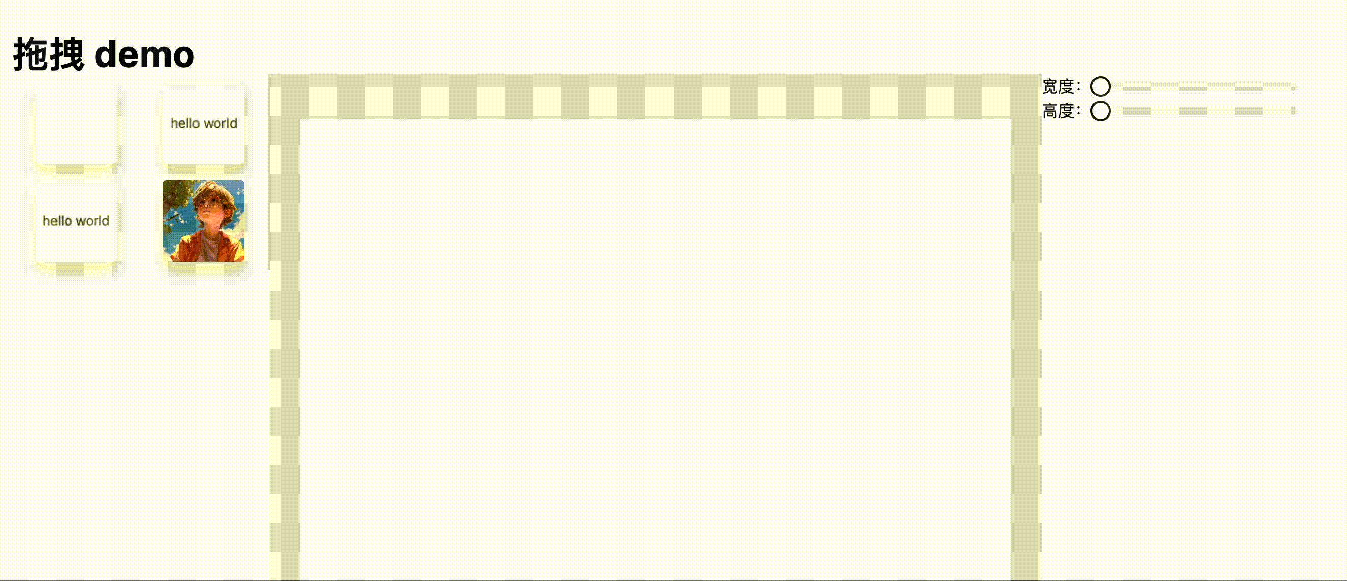
Hi, I’m Axing. I don’t know if you’ve ever needed to implement drag-and-drop functionality, or if you’re just curious about draggable elements. If so, this article might be worth a read. Next, I’ll use react-dnd and react-moveable to build the following drag-and-drop demo. Let me show you the result first:
 Here’s the source code: https://github.com/coderPerseus/drag-drop. If it helps you, feel free to star it—thanks!
Requirement Analysis
First, let’s find a nice low-code platform. I went with Alibaba’s low-code engine: https://lowcode-engine.cn/demo/demo-general/index.html. Take a look to get a feel for what a low-code platform is like.
Now let’s build a minimal version of the demo! From the GIF above, you can see the page is divided into three parts, or more precisely, four parts:
- Navigation Bar: Contains global configurations, operations, etc.
- Left Material Panel: Holds materials that can be dragged to the center. Some platforms also include a page tree or JSON data viewer. Here we’ll just implement material display and dragging.
- Center Display & Drop Zone: Receives materials dragged from the left. You can also rearrange items here, and click on them to trigger the corresponding property editor on the right.
- Right Property Editor: Select a dragged element and edit its properties.
Alright, we’ve broken down the requirements. Let’s start building step by step!
Project Setup
We’ll create a project using Next.js! Refer to the docs: https://nextjs.org/docs/getting-started/installation. Run npx create-next-app@latest,
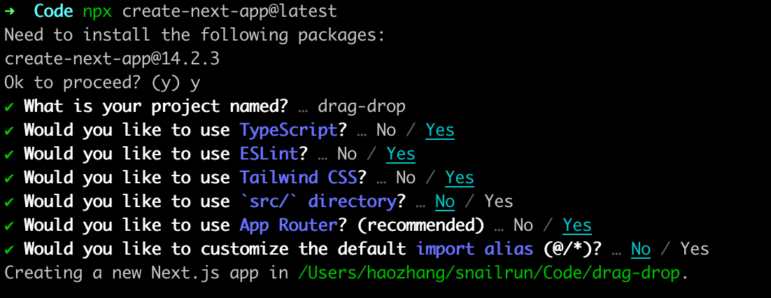 Wait for installation to finish, then start the project with
 npm run dev. Node version must be >= 18.17!
After deleting the unnecessary content in app/page.tsx, we create the component files we need:
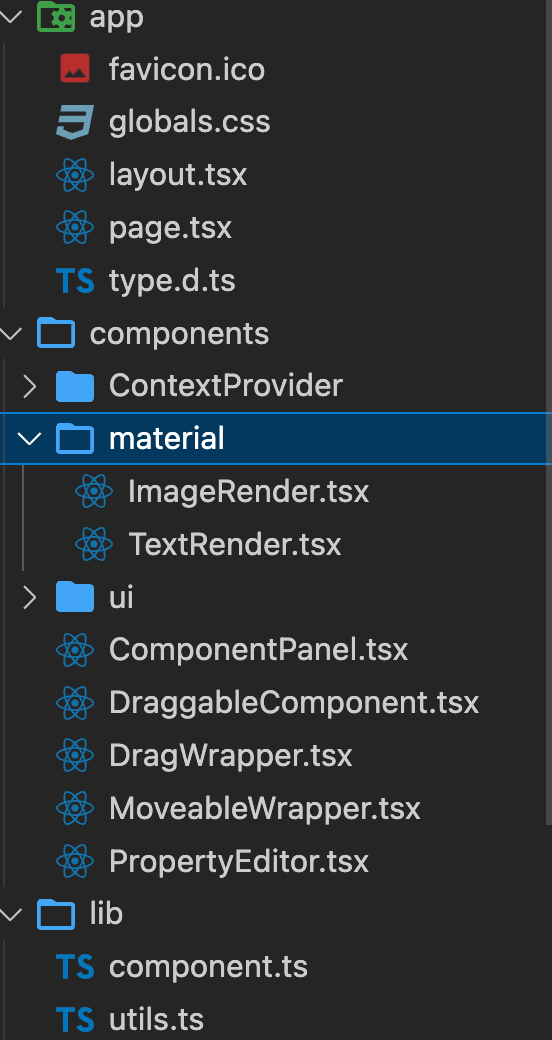
-
app: page directory, contains our main page. -
components: component directory.ContextProvider: A data-sharing component based onuseContext, enabling data synchronization across multiple components. When you move an element in the center, the right side updates accordingly.material: Contains all the materials on the left, including image and text materials (rendered dynamically via a mapping). This is where the rendering logic for all material types on the left lives.DraggableComponent: The left-side component panel that displays the draggable component library. It renders a preset array of materials, each wrapped withDragWrapper(described below) to make them draggable.ComponentPanel: The design panel where components are placed and edited. It renders the array of elements dragged from the left, usingMoveableWrapperto make page elements draggable.PropertyEditor: The right-side property editor for editing material properties. It receives a configuration to render the corresponding form.DragWrapper: A wrapper component for draggable components, using react-dnd.MoveableWrapper: A wrapper component for movable components, using react-moveable. -
lib: Contains component data undercomponentand utility functions underutils.
Simple, right? This is the simplest low-code builder—you drag and drop to get the corresponding JSON data. But a real low-code builder is much more complex.
Difficulties & Gotchas
The real challenge of this project is the data structure. You need to design a data structure flexible enough to accommodate any element.
The gotcha: when I refreshed the page after dragging an element into the design area, that element couldn’t be selected. I eventually found out that the target property of moveable needs to be updated dynamically. So I used a useState for the target, and whenever the currently selected element or the JSON data changed, I updated the target. That fixed the bug. But it took me a long time to figure out that was the root cause.
End
Thanks for reading!