Full-page Theme Switch Animation with the View Transitions API
/ 13 min read /
Table of Contents 目录
This is a translated article. Original: https://akashhamirwasia.com/blog/full-page-theme-toggle-animation-with-view-transitions-api
The Telegram app has a very interesting animation when toggling its dark mode — the dark theme expands from the toggle switch to cover the entire app. I’ve always wondered how this works under the hood and how to replicate it on the web. I’m happy to report that thanks to the upcoming View Transitions API in browsers, this is finally possible on the web.
This article will show you how to implement the following animation for a dark theme toggle using the View Transitions API. I’ll demonstrate it in a React project, but the View Transitions API is a browser primitive, so you can use plain JavaScript or any other framework/library.
How Does the View Transitions API Work?
The interaction I built here becomes easier to understand once you understand how the View Transitions API works:
- When the API is called to start a view transition, the browser captures the current state of the page as a screenshot. This is called the “old” state of the page.
- Then, the API runs some code to update the page to the next state that needs to be animated.
- Now the browser has the next state ready, and it captures it as another screenshot. This is called the “new” state of the page. At this point, the user still sees the “old” state, and all these updates to the “new” state happen only in memory, not rendered on the display yet.
- With screenshots of both the “old” and “new” states, the browser loads them into the
::view-transition-oldand::view-transition-newpseudo-elements. - Finally, a CSS animation runs between these two pseudo-elements to reveal the
::view-transition-newpseudo-element. - When the animation ends, the pseudo-elements are removed, and the browser renders the already-loaded “new” state (from step 3) on screen.
Implementing the Animation in React
The following code is a basic dark theme toggle implementation that stores its state in a React state variable and switches the dark class on the <html> element via an associated effect. For simplicity, the toggle component uses Radix UI, but you can use any component library or a custom toggle.
import { useState, useEffect } from 'react';import * as Switch from './Switch';import { IconMoon, IconSun } from './Icons';
export default function App() {  const [isDarkMode, setIsDarkMode] = useState(false);
  const toggleDarkMode = (isDarkMode) => {    setIsDarkMode(isDarkMode);    // Animation code goes here  };
  useEffect(() => {    if (isDarkMode) {      document.documentElement.classList.add('dark');    } else {      document.documentElement.classList.remove('dark');    }  }, [isDarkMode]);
  return (    <div className="h-screen w-screen flex items-center justify-center bg-white dark:bg-gray-950">      <Switch.Root checked={isDarkMode} onCheckedChange={toggleDarkMode}>        <Switch.Thumb>          {isDarkMode ? <IconMoon /> : <IconSun />}        </Switch.Thumb>      </Switch.Root>    </div>  );}
To use the View Transitions API, we need to call document.startViewTransition() and pass a callback that defines how the page should update to the next state to be animated (step 2 in “How the View Transitions API Works”).
Our initial thought is to simply move the setIsDarkMode call inside this callback. After all, that’s the action that triggers the page update to dark mode. While this idea is correct, there’s a small problem in our understanding. React doesn’t update the DOM immediately after a state update. DOM updates are asynchronous and may happen long after the setState call. Therefore, after calling setIsDarkMode(isDarkMode), by the time the document.startViewTransition() callback ends, we cannot guarantee that the DOM is already in its new state (in this example, the dark theme state).
This is a problem because startViewTransition() needs the page’s new state to perform the animation. So how do we solve this?
flushSync() to the Rescue!
Fortunately, React provides the flushSync() function, which applies all DOM updates synchronously after a state variable change. Although the React docs have a big warning that using it is uncommon and may impact performance, as shown in this article, it’s perfectly fine to use with the View Transitions API.
But what if I’m not using React?
If you’re using another framework, it likely has a similar function to apply DOM updates synchronously. In Vue, it’s nextTick, and in Svelte, it’s tick.
To integrate flushSync() into our code, we can simply wrap the setIsDarkMode() call in a callback and pass it to flushSync(). This ensures that startViewTransition has the latest state of the page when its callback ends.
import { useState, useEffect } from 'react';import { flushSync } from 'react-dom';import * as Switch from './Switch';import { IconMoon, IconSun } from './Icons';
export default function App() {  const [isDarkMode, setIsDarkMode] = useState(false);
  const toggleDarkMode = (isDarkMode) => {    document.startViewTransition(() => {      flushSync(() => {        setIsDarkMode(isDarkMode);      });    });  };
  useEffect(() => {    if (isDarkMode) {      document.documentElement.classList.add('dark');    } else {      document.documentElement.classList.remove('dark');    }  }, [isDarkMode]);
  return (    <div className="h-screen w-screen flex items-center justify-center bg-white dark:bg-gray-950">      <Switch.Root checked={isDarkMode} onCheckedChange={toggleDarkMode}>        <Switch.Thumb>          {isDarkMode ? <IconMoon /> : <IconSun />}        </Switch.Thumb>      </Switch.Root>    </div>  );}
With just a few lines of code, we now have a nice default fade animation on the page when the theme toggles. This is much better than no animation at all!
Implementing the “Growing Animation”
To customize the default fade animation provided by the View Transitions API, we can simply apply CSS animations on the ::view-transition-old(root) and ::view-transition-new(root) pseudo-elements (see step 5 of how the View Transitions API works). The (root) in these pseudo-elements targets the view transition applied to the <html> element.
The “growing animation” we want is tricky to implement directly in pure CSS because the toggle’s position might change at different breakpoints, and it’s hard to determine its exact position with CSS alone. In this case, we can use the animate() function in JavaScript to run CSS animations programmatically, giving us the flexibility to locate the exact position of the toggle.
What is the Growing Animation?
If we try to analyze the growing animation, it consists of three parts:
- Starting from the toggle’s position, a circle begins to grow.
- Inside the circle, the “new” state of the page is rendered.
- The circle continues growing until it covers the entire screen.
Let’s tackle part 2 first.
How can we restrict the display area of page elements on the screen? In other words, can we create a circular clipping mask that only shows elements inside the circle?
The answer is yes! This can be achieved with the clip-path property in CSS! The clip-path property takes a shape that is used as a clipping mask for the element it’s applied to. We need a circular mask, and luckily, clip-path already supports the circle function for this purpose.
This is the syntax for the circle function:
circle(<radius of the circle> at <x coord of center> <y coord of center>)The position of the circle’s center is relative to the top-left corner of the element.
Now parts 1 and 3 should become straightforward. We need to animate the clip-path property from a circle with radius 0 centered at the toggle, to a circle that covers the entire screen, still centered at the toggle. The position of the toggle element can be obtained using the getBoundingClientRect() function.
So the animation flow is:
- Start: Circle radius is 0, center is at the toggle.
- End: Circle radius gradually increases until it covers the whole screen, center still at the toggle.
Using getBoundingClientRect(), we can get the position of the toggle element relative to the viewport, and then use these coordinates to set the initial and final states of clip-path, achieving the growing animation.
import { useState, useEffect, useRef } from 'react';
export default function App() {  const [isDarkMode, setIsDarkMode] = useState(false);  const ref = useRef(null);
  const toggleDarkMode = (isDarkMode) => {    if (!ref.current) return;
    document.startViewTransition(() => {      flushSync(() => {        setIsDarkMode(isDarkMode);      });    });
    const { top, left } = ref.current.getBoundingClientRect();    const x = left;    const y = top;
    document.documentElement.animate(      {        clipPath: [          `circle(0px at ${x}px ${y}px)`,          `circle(300px at ${x}px ${y}px)`,        ],      },      {        duration: 500,        easing: 'ease-in-out',        pseudoElement: '::view-transition-new(root)',      }    );  };
  // useEffect(() => { ...
  return (    <div className="h-screen w-screen flex items-center justify-center bg-white dark:bg-gray-900">      <Switch.Root checked={isDarkMode} onCheckedChange={toggleDarkMode}>        <Switch.Thumb ref={ref}>          {isDarkMode ? <IconMoon /> : <IconSun />}        </Switch.Thumb>      </Switch.Root>    </div>  );}
Note that the animation in the code above is only applied to ::view-transition-new(root) because we only want to apply the clip-path to the “new” state of the page.
We also need to turn off the default fade animation and the applied blend mode. This can be done directly in CSS:
::view-transition-old(root),::view-transition-new(root) { animation: none; mix-blend-mode: normal;}Since we’re using programmatic animation, another change is needed. The startViewTransition() function returns an object that has a .ready property. This property is a Promise that resolves when the browser is ready to perform the transition and has attached the ::view-transition-* pseudo-elements to the DOM. If these elements aren’t attached to the DOM, our animate() call will run too early and the animation won’t execute. So we need to wait for the .ready property to resolve before running the animation.
import { useState, useEffect, useRef } from 'react';import { flushSync } from 'react-dom';import * as Switch from './Switch';import { IconMoon, IconSun } from './Icons';
export default function App() {  const [isDarkMode, setIsDarkMode] = useState(false);  const ref = useRef(null);
  const toggleDarkMode = async (isDarkMode) => {    if (!ref.current) return;
    await document.startViewTransition(() => {      flushSync(() => {        setIsDarkMode(isDarkMode);      });    }).ready;
    const { top, left } = ref.current.getBoundingClientRect();    const x = left;    const y = top;
    document.documentElement.animate(      {        clipPath: [          `circle(0px at ${x}px ${y}px)`,          `circle(200px at ${x}px ${y}px)`,        ],      },      {        duration: 500,        easing: 'ease-in-out',        pseudoElement: '::view-transition-new(root)',      }    );  };
  useEffect(() => {    if (isDarkMode) {      document.documentElement.classList.add('dark');    } else {      document.documentElement.classList.remove('dark');    }  }, [isDarkMode]);
  return (    <div className="h-screen w-screen flex items-center justify-center bg-white dark:bg-gray-950">      <Switch.Root checked={isDarkMode} onCheckedChange={toggleDarkMode}>        <Switch.Thumb ref={ref}>          {isDarkMode ? <IconMoon /> : <IconSun />}        </Switch.Thumb>      </Switch.Root>    </div>  );}// styles.css::view-transition-old(root),::view-transition-new(root) {  animation: none;  mix-blend-mode: normal;}
The animation is already running! Although there are still some imperfections (literally), I want to pause and thank you if you’ve read and understood all of the above! ❤️
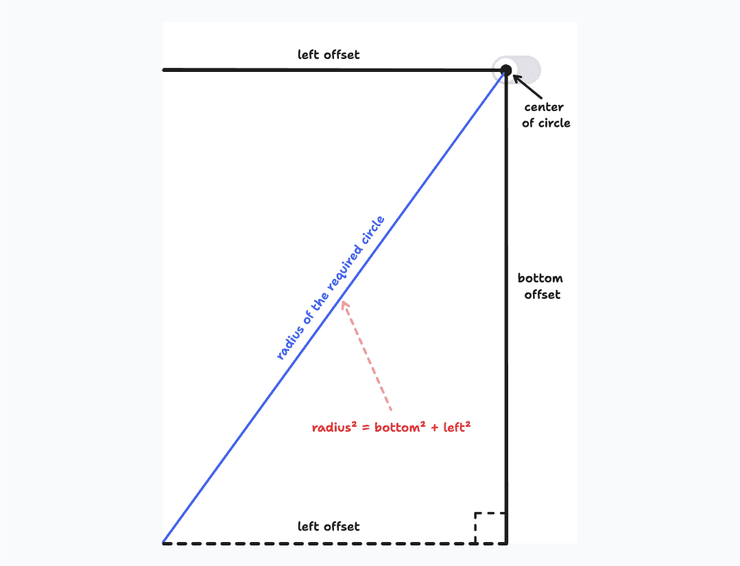
The current problem is that the radius of the circular mask, which should cover the entire screen, is not large enough to cover the whole screen. This radius is a hardcoded value that may not work effectively for different screen sizes. We need to calculate this radius accurately based on the user’s screen size. This involves some math and geometry, but if you try to compute the radius of a circle that can cover the screen, it’s actually the hypotenuse of a right-angled triangle formed by the larger vertical and horizontal offsets from the toggle on the screen.
To calculate this radius, we can use the following formula:
- Get the screen offset of the toggle element:
getBoundingClientRect(). - Calculate the maximum horizontal and vertical offsets.
- Compute the radius:
radius = Math.sqrt(horizontalOffset^2 + verticalOffset^2).
This ensures the circular mask is large enough to cover the entire screen.
This math can be implemented with the following code:
import { useState, useEffect, useRef } from 'react';import { flushSync } from 'react-dom';import * as Switch from './Switch';import { IconMoon, IconSun } from './Icons';
export default function App() {  const [isDarkMode, setIsDarkMode] = useState(false);  const ref = useRef(null);
  const toggleDarkMode = async (isDarkMode) => {    if (!ref.current) return;
    await document.startViewTransition(() => {      flushSync(() => {        setIsDarkMode(isDarkMode);      });    }).ready;
    const { top, left } = ref.current.getBoundingClientRect();    const x = left;    const y = top;    const right = window.innerWidth - left;    const bottom = window.innerHeight - top;    // Calculates the radius of circle that can cover the screen    const maxRadius = Math.hypot(      Math.max(left, right),      Math.max(top, bottom),    );
    document.documentElement.animate(      {        clipPath: [          `circle(0px at ${x}px ${y}px)`,          `circle(${maxRadius}px at ${x}px ${y}px)`,        ],      },      {        duration: 500,        easing: 'ease-in-out',        pseudoElement: '::view-transition-new(root)',      }    );  };
  useEffect(() => {    if (isDarkMode) {      document.documentElement.classList.add('dark');    } else {      document.documentElement.classList.remove('dark');    }  }, [isDarkMode]);
  return (    <div className="h-screen w-screen flex items-center justify-center bg-white dark:bg-gray-950">      <Switch.Root checked={isDarkMode} onCheckedChange={toggleDarkMode}>        <Switch.Thumb ref={ref}>          {isDarkMode ? <IconMoon /> : <IconSun />}        </Switch.Thumb>      </Switch.Root>    </div>  );}// styles.css same as above
The animation works as expected! Since we used math to calculate this radius, it will work regardless of where the toggle is on the screen, making the component very flexible for users 🙌
Adding the Final Touches
There are a few subtle improvements we can make to this interaction:
- Center of the circular mask: Currently, the circular mask grows from the top-left corner of the toggle because we’re using the
topandleftoffsets returned bygetBoundingClientRect(). To center the circle on the toggle, we can calculate new offsets by addingheight / 2andwidth / 2of the toggle to thetopandleftoffsets respectively. - View Transitions API compatibility: At the time of writing, the View Transitions API is still experimental and not supported in all major browsers (check support here). To prevent the interaction from breaking in those browsers, we can add a check that calls
setIsDarkMode()and returns early if the View Transitions API is not supported. - Respecting reduced motion preference: Some users may have the reduced motion option enabled in their operating system. To respect this setting, we can also disable the animation by adding a media query check and returning early when the user has enabled reduced motion.
Final Code
import { useState, useEffect, useRef } from 'react';import { flushSync } from 'react-dom';import * as Switch from './Switch';import { IconMoon, IconSun } from './Icons';
export default function App() {  const [isDarkMode, setIsDarkMode] = useState(false);  const ref = useRef(null);
  const toggleDarkMode = async (isDarkMode) => {    /**     * Return early if View Transition API is not supported     * or user prefers reduced motion     */    if (        !ref.current ||        !document.startViewTransition ||        window.matchMedia('(prefers-reduced-motion: reduce)').matches    ) {      setIsDarkMode(isDarkMode);      return;    }
    await document.startViewTransition(() => {      flushSync(() => {        setIsDarkMode(isDarkMode);      });    }).ready;
    const { top, left, width, height } = ref.current.getBoundingClientRect();    const x = left + width / 2;    const y = top + height / 2;    const right = window.innerWidth - left;    const bottom = window.innerHeight - top;    const maxRadius = Math.hypot(      Math.max(left, right),      Math.max(top, bottom),    );
    document.documentElement.animate(      {        clipPath: [          `circle(0px at ${x}px ${y}px)`,          `circle(${maxRadius}px at ${x}px ${y}px)`,        ],      },      {        duration: 500,        easing: 'ease-in-out',        pseudoElement: '::view-transition-new(root)',      }    );  };
  useEffect(() => {    if (isDarkMode) {      document.documentElement.classList.add('dark');    } else {      document.documentElement.classList.remove('dark');    }  }, [isDarkMode]);
  return (    <div className="h-screen w-screen flex items-center justify-center bg-white dark:bg-gray-950">      <Switch.Root checked={isDarkMode} onCheckedChange={toggleDarkMode}>        <Switch.Thumb ref={ref}>          {isDarkMode ? <IconMoon /> : <IconSun />}        </Switch.Thumb>      </Switch.Root>    </div>  );}//styles.css same as above
This final version includes the following improvements:
- Calculates the center of the toggle so the circular mask grows from the toggle’s center.
- Adds a check for View Transitions API support to avoid issues in unsupported browsers.
- Adds a check for the reduced motion preference to skip the animation when the user has enabled it.
I’m very happy to have finally implemented this interaction that I’ve used countless times in the Telegram app. The View Transitions API unlocks many possibilities for web animations. Although the API is quite simple, the effects you can create with it are almost infinite! I look forward to seeing all the different animations and interactions web developers will create with this API and how it can be used to build more delightful web experiences.
References
- [developer.chrome.com/docs/web-platform/view-transitions](https://developer.chrome.com/docs/web-platform/view-transitions/)
- [react.dev/reference/react-dom/flushSync](https://react.dev/reference/react-dom/flushSync/)
- [drafts.csswg.org/css-view-transitions-1](https://drafts.csswg.org/css-view-transitions-1/)